slides and commentary from a talk at PDX DataViz Meetup
hosted by @Periscopic
Portland, Oregon
October 1 2014
thx again to Kim Rees, Dino Citraro, and Meli Lewis for the invite!
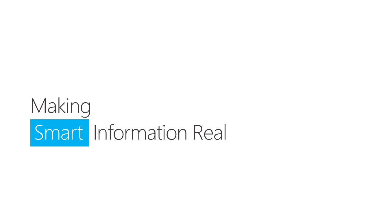
“Making Smart Information Real”
a talk by Mike Pell

If you’re curious, I’m a Designer/Coder/Disruptor who’s been at MSFT for over 12 years now. Worked in alot of groups across the company – mobile, search, cloud, office, etc. Currently having a great time in The Microsoft Garage.
So, what is “smart information” anyway?
It’s how I refer to a vision for anyone being able to deeply interact with any type of information in ways that aren’t generally available yet.

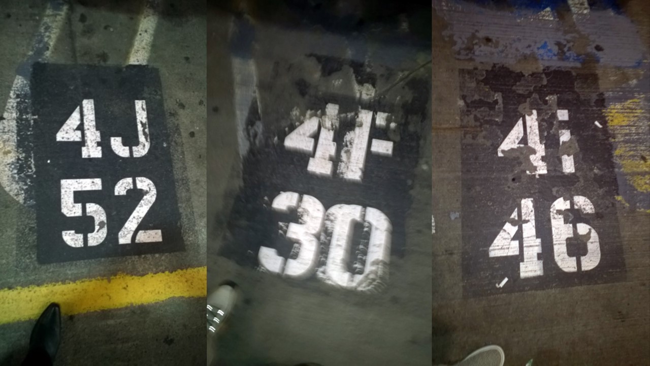
Is that Smart Information?
No. That’s obviously a filthy, disgusting subway sign in NYC with some redeeming Swiss typography.
Is that Smart Information?
No, definitely not. If I have to take a picture of where I parked, this information is not helping.
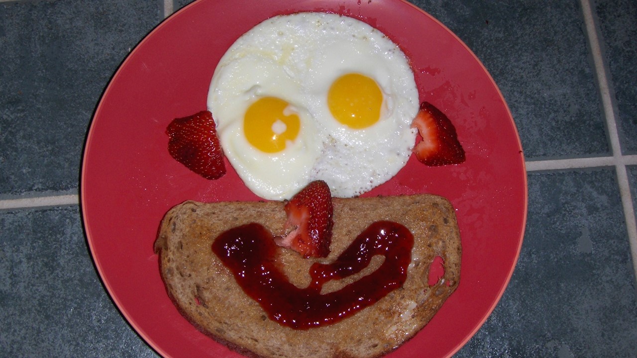
Is that Smart Information?
No. But, it was a really great breakfast :-)
That must be Smart Information, right?
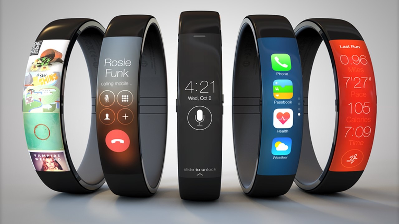
Nope. Just a really stunning design comp by Todd Hamilton showcasing how smart devices and slick software could provide great experiences. The data shown within the displays is still dumb as hell.
Smart Information?
Yes, absolutely. Why? Because it can tell you more about itself on demand, optimized for quick and clear communication of the most relevant detail.

Why should we care about creating Smart Information?
Well, to start – information (in all of its forms) is now center stage in how we’ve come to think about designing almost any kind of experience – whether entertainment, business, art, or education. Yet, it’s almost completely static in most cases.
As a community of super-smart practitioners worldwide, it’s time to get ourselves into a position where we could leverage each other’s great work in our quest for information that isn’t just dead pixels, but rather capable of telling its own story if asked.
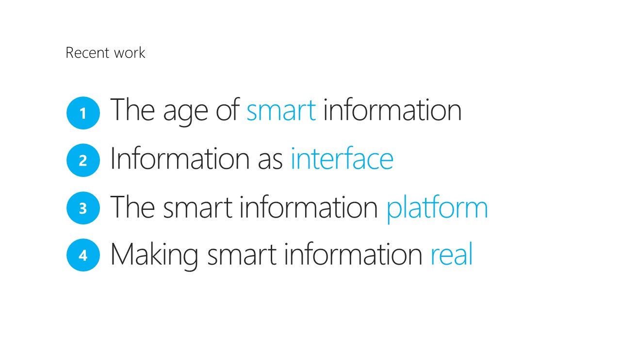
The quest for Smart Information has taken me on a journey through different phases of the process over the last several months. Over the course of four talks, I’ve outlined how we get from A to B, and how we each have a critical role to play in its evolution.
Bonus: secret phrase encoded in the talk titles.
OK, you’re right… I did just make that up. But, it is what we’re after.
Making a smart interface platform real.
PART 1 – SOME CONTEXT
In my talk at Visualized 2014 in NYC, the vision for smarter future was painted, and the challenge for each of us to do our part issued.
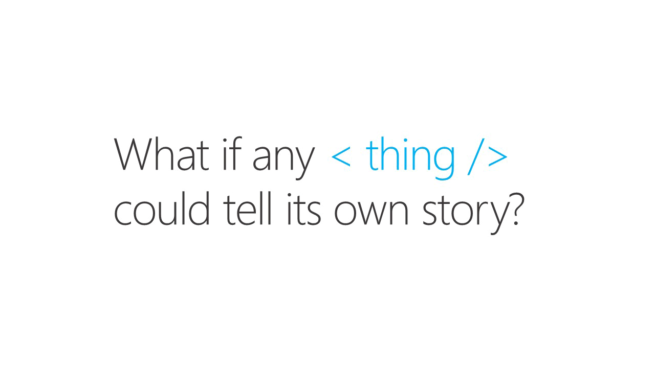
The basic premise of the talk was this –
“What if any <thing/> could tell its own story?”
In this context, my definition of is quite broad. I’m really talking about visualizations, infographics, data sets, and information in general.
If we agree that’s useful and desirable in some situations, the next question logically is “how would we get there?”
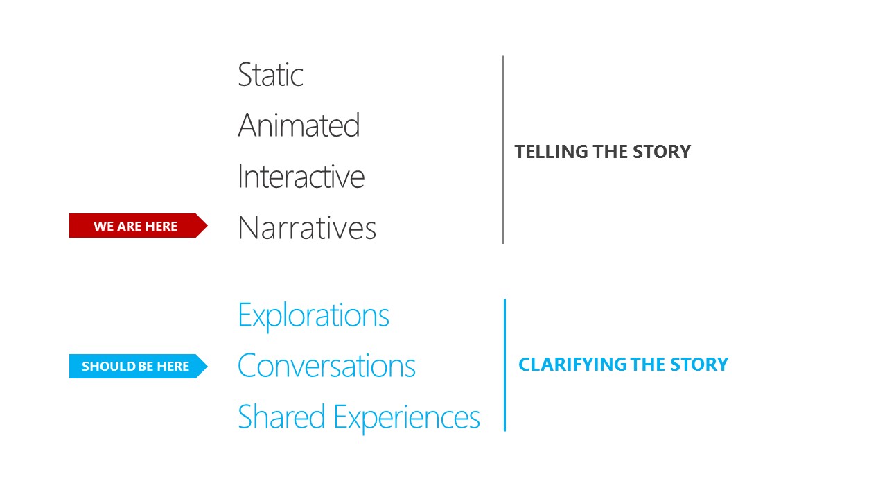
We seem to be just on the verge of a leap across the chasm – from today’s predominantly static content and rudimentary interactivity (telling the story), to the next phase of information’s evolution – the ability to deeply engage, explore, and share without friction (clarifying the story).
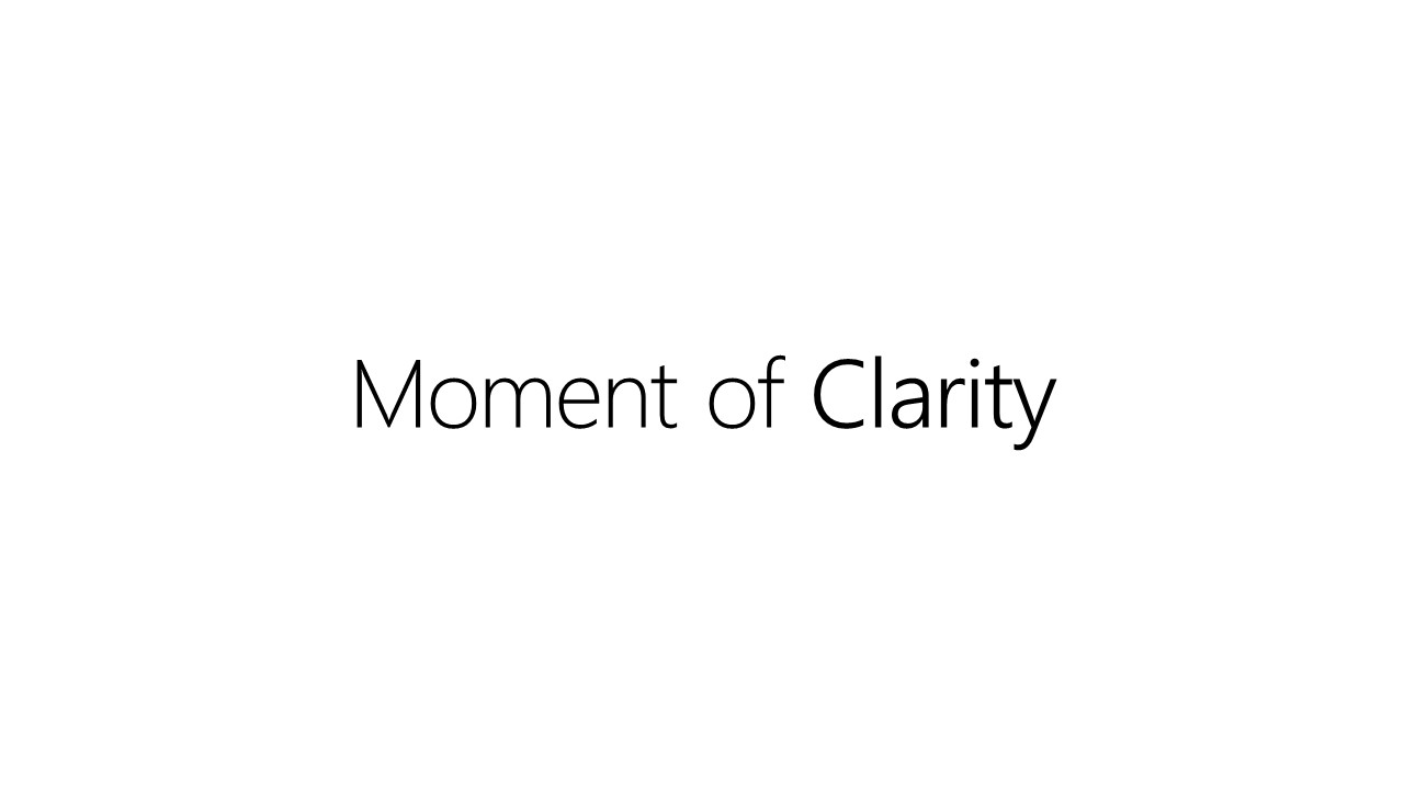

Clarity = Sharp Focus.
When communicating information, we should strive to get our audience to the moment of clarity as quickly as possible. Why make them wallow and wander in content, having to reach insights by themselves rather than speed them to the point? They can decide what to do next, whether that’s making a decision or taking action (or not).

To get from where we are today to where we should be in terms of shifting our focus to exploration and understanding, we’ll have to approach our work from a very different perspective.
DEMO
This quick demo illustrates how even a simple electronic newspaper article can quickly summarize its key points upon request or be deeply explored in a fluid manner that supports natural curiosity.

Here’s how that would play out as shown in my “New York Times” demo from Visualized 2014.
PART 2 – WE WANT MORE

We have made the transition from information being held captive inside user interface widgets needed to consume or author, to a world where it’s front and center.

Even programs like Microsoft Word have greatly reduced the footprint of “chrome” (the Ribbon still has menus, toolbars, palettes, etc but they can be hidden and for the most part stay out of the way of the content). The “chrome” is often completely hidden in Modern app design.

When looking at well designed information like this from an EU Energy project, I’m finding it more common that people assume and expect interactivity in our content and are familiar with the basics. So, you would assume the content or information itself has little need to show affordances up front. Check it out for yourself at EU Energy data

The content itself should now be considered the primary user interface, not the chrome and affordances that were bolted on in previous eras.
So, it follows that information display or visualization of data must inherently support exploration and direct manipulation of elements to assist in discovery and understanding.

We also need to replicate the common interaction language we all know and use today. Any predictable and simple set of gestures could become a new de facto language of communicating, exploring, and interacting with information. The details of this should be worked out in practice where we develop a shared library of common gestures (touch, air, pen) that help people work with information more fluidly than today.
Every Design student will say I’m an idiot for saying this, but think about it – this is absolutely true for “smart information”.
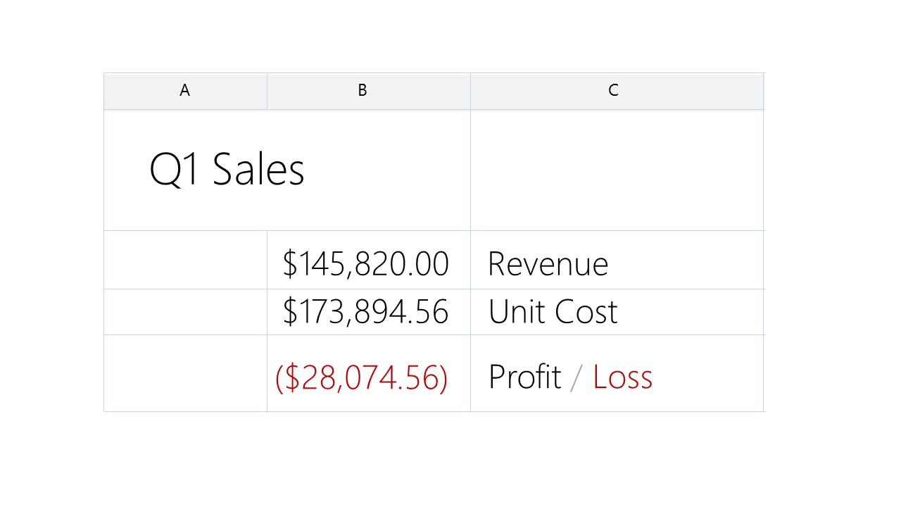
This example should be pretty obvious. You’d expect poking this would invoke something like Microsoft Excel based on the shape of the information, right?

Thought exercise: What do you think this shape would allow?
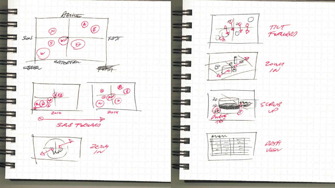
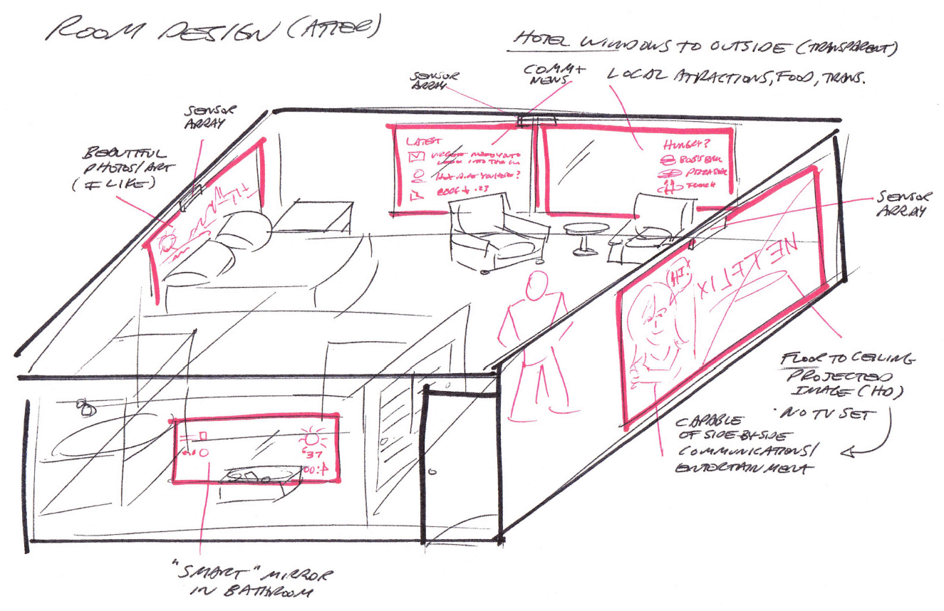
When I see visualizations, my mind goes immediately to how you’d interact and explore the information. These sketches are an example of how I start to envision standard “conversations” with smart information or data sets.

To get from where we are today to where we should be in terms of shifting our focus to exploration and understanding, we’ll have to approach our work from a very different perspective.
DEMO
Here’s an example of taking something not widely regarded as data, but applying the same experience design principles and infrastructure to show how artwork can be deeply explored just as we would a rich data set.

The mixed media artwork of NYC artist Sharon Pell-Lie is densely multi-layered, utilizing vintage maps as its core data sets in which deeper insights are revealed upon exploration.
You can see the “artwork demo” from my Visualized 2014 talk.
video demo at 16:30 min mark
PART 3 – DUTY NOW FOR THE FUTURE

This section focuses on the technology infrastructure, conventions, and behaviors we need to define and invest in. Ultimately, any successful movement will depend upon a platform that can be leverage quickly and easily by most of us. We need to stop reinventing things every time. Shared platforms are one way of thinking about addressing that need.

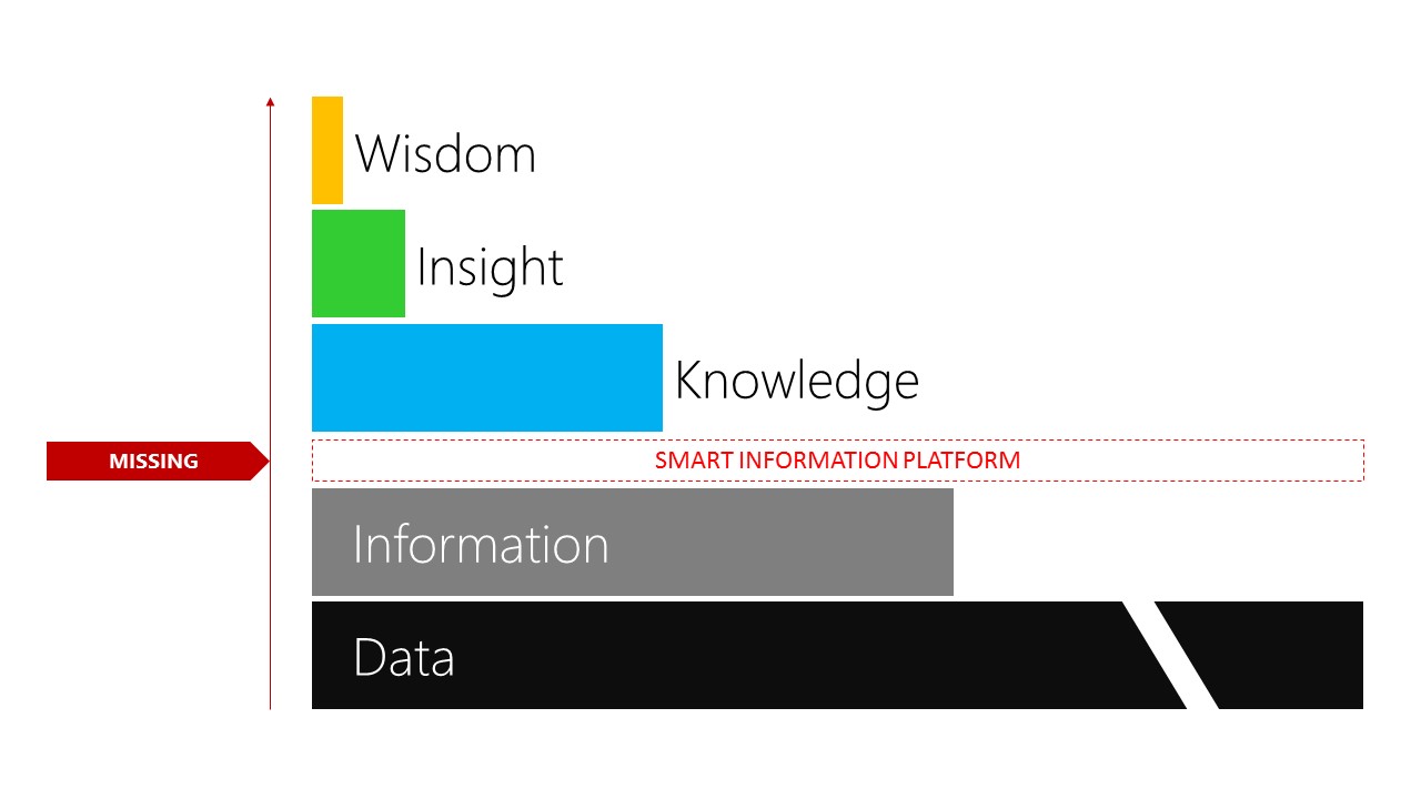
In the grand scheme of things, we’ve only scratched the surface of what’s eventually possible when turning raw data and information into insights, knowledge and wisdom.
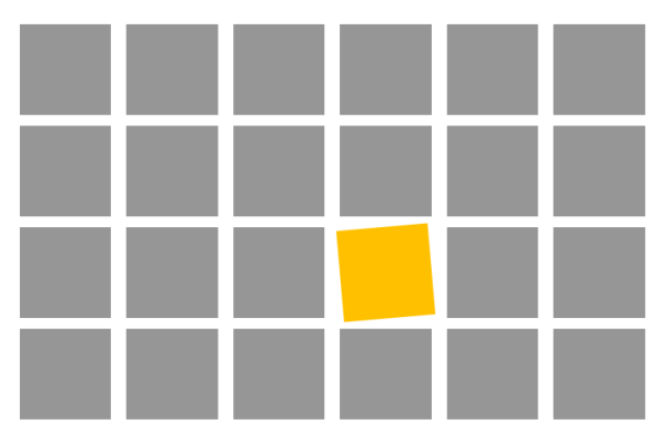
The colored section in the diagrams (above) represents our focus these days – mining the foundation of data and information for greater understanding – predominantly through highly manual means. There are many tools and approaches available to create knowledge and even insight these days, but achieving wisdom remains a human activity.
(Production note: Upon some reflection, I changed this slide from the one presented at PDX. This seems easier to understand and probably more accurate.)
If we’ve already built tools to produce insights, then why do we need a smart information platform?
Several reasons, but the main one is we need to stop spending so much time, effort and money on the highly manual and painstaking process of producing the visualizations and infographics from cleaned data sets.
Conceptually, the platform sits above raw data and information, but the truth is we need to aim lower. Data should eventually appear to come wrapped in smart information containers, accessed through common protocols, and manipulated through well documented mechanisms in the interchange and interaction platform libraries.

How so we get there? Good question. The simplest answer on the technical side is to start wrapping data in containers that can be accessed and utilized in predictable ways. The format, protocols and APIs are all things we’ll have to work together as a community to figure out.

Getting there requires and inversion of process, and quite a mindshift from where we are today. We need to start from the experience perspective, not cleaning the data set (heresy, i know). It’s fairly straightforward to imagine how this is done on the technical foundation side by wrapping the data in containers that know how to interoperate, but the design of smart information from an experience approach takes us to a place where it’s assumed that all data sets, visualizations, and infographics respond effortlessly to curiosity and inquiry. It feels as if they knew what you were going to be interested in before you even asked.

Start from the end really means putting the information consumer’s experience first. What do you want them to get out this? What state of mind could they be in? Envisioning how it feels to interact with smart information before diving into the detail, minutia, and drudgery of data cleaning is where we can truly understand how the information containers need to be built. Easy to say, harder to do in practice.
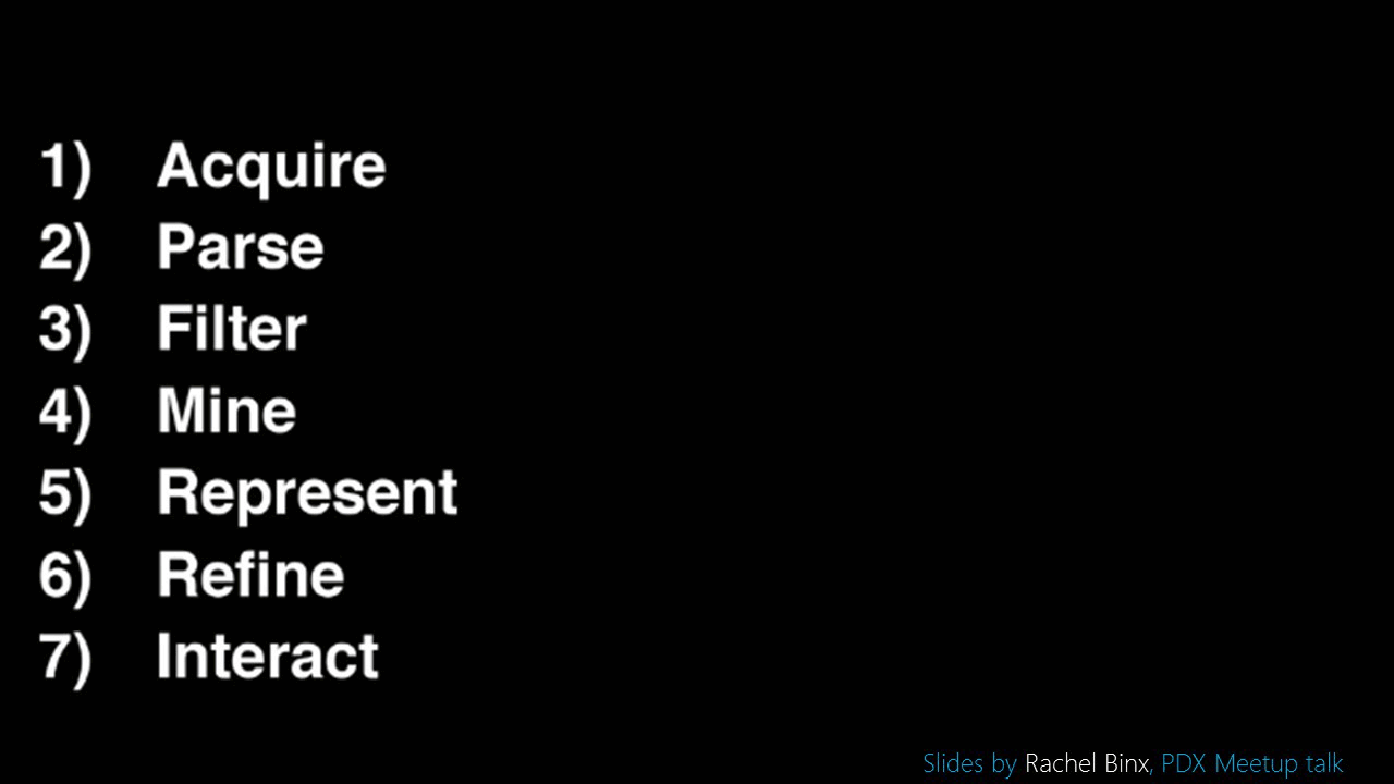
In fact, one of the leading voices in the data visualization space these days makes this point better than I ever could. Rachel Binx presented this set of slides at the September PDX Data Viz meetup. I couldn’t agree more – many of us still leave the hardest part (designing and implementing the interaction with data) for the very end. The smart information platform needs us to build in as much of this base interaction as possible – much like the iOS developer experience provides sophisticated behaviors and animation so people can focus on the content itself.
Even if we did always start from the experiential part of the equation, the question still remains as to what behaviors and interactions are actually desired by both the author and the consumer. The best way to think about this is to think about your pleasant surprises – signature moments, that have happened while exploring and learning.
There’s a magic you feel emotionally when something becomes crystal clear to you. We need to get much better at engineering that moment of clarity.
Everyone who uses a computer knows you can Copy something from one place and Paste it into another. It’s so basic, we hardly spend any time thinking about it at all. Entry level skill, expected capability of any system. That’s exactly what we need to define together for the smart information platform – those expected capabilities and common interactions anyone would reasonably expect from a well-designed content of any sort.

But, there is still something we are fighting against in our quest to reach smart information – first impression. We can’t keep designing primarily for initial aesthetic and first impressions. No question that’s important, and has to be present to a degree, but we get so much further with understanding when natural curiosity is rewarded with true gems. Lasting impressions are not far behind.
PART 4 – LET’S GET REAL
Everything to this point is really just a bunch of talk – so, let’s get real. This doesn’t require committees, meetings or anything formal. It’s up to each of us to stop talking and start doing. We need to start publishing more examples of how we can build upon simple platforms and techniques, then leverage each other’s work.
Driving this vision into reality is mostly about getting started with the first small step – create wrappers around data sets that allow them to be consistently reused and leveraged. Don’t overthink it – just do it.
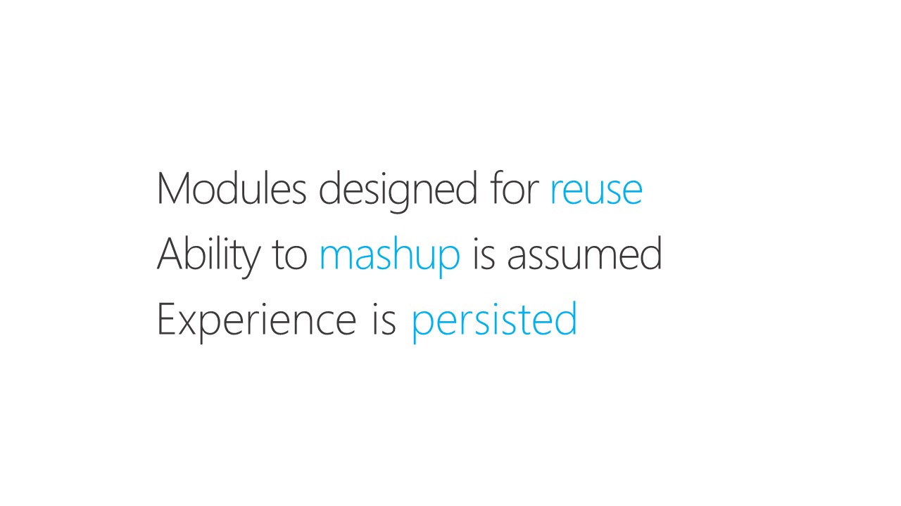
From there it leads to these becoming true:


In closing…

We really can’t do this alone. There has to be a truly open exchange of ideas, code, and technique to move all of this forward quickly.

There’s no question the Smart Information future is going to happen.
Are you in?


 The truth is, at times we’re all seduced by the idea of immortality through our work.


