Current Thinking

“HoloScenes”

a holographic visualization series

holoscenes_05


We are all still in the very early days of exploring this game changing medium called Mixed Reality.

These conceptual dives into the world of Holographic Visualization are intended to spark your imagination. Let’s figure out together how we can best take best advantage of this multi-dimensional design space. These pieces fast forward us to a time when we’ll all think nothing of it. It’ll be ubiquitous and quite expected — that’s why the observer can see all of the publicly visible holograms.

A continuing series.

– M. Pell

UPDATE – you can get a behind-the-scenes look at the design process used here by reading The Making of HoloScenes


Guest Speaker

“Guest Speaker”


Next Quarter


“Next Quarter”


In the Data


“In the Data”


Break Time


“Break Time”


Gallery


“Gallery”


 Live from Somewhere


 “Live from Somewhere”


Ready Player One


“Ready Player One”


M. Pell

ABOUT THE ARTISTMike Pell is leading Design for The Microsoft Garage, an innovation accelerator turning employee’s wild ideas into reality daily, worldwide. Bold, insightful and uncompromising, Mike is recognized as a thought leader in the field of Holographic Visualization and Smart Information.

Current Thinking, Talks

Interview: “The Moment of Clarity”

The Moment of Clarity


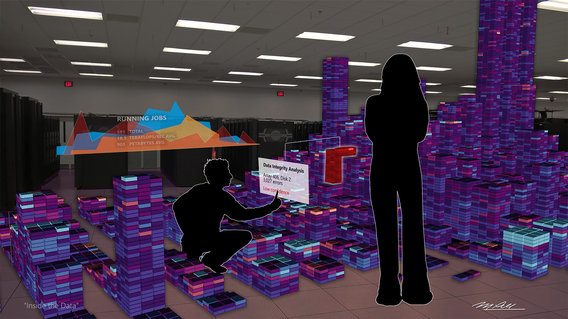
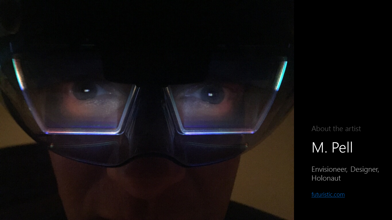
< Transcript of PolicyViz episode #41 with Jon Schwabish interviewing Mike Pell >


Jon :  Welcome back to the PolicyViz podcast. I’m your host, Jon Schwabish. I’m excited to welcome to the show this week Mike Pell from Microsoft. Mike is a Design Envisioneer, which is an awesome title at Microsoft in a group called The Garage. Mike, welcome to the show.

M. Pell :  Hey, Jon. Thanks for having me on.


Jon :  Great to have you on. I want to start by maybe having you introduce yourself and talk a little bit about your background. Then also maybe if can talk a little bit about what you do in The Garage at Microsoft, which in addition to being an awesome personal title, is an awesome name for a group to work in. It just sounds like you’re hanging around with friends building cool stuff. Let’s start there.


M. Pell :  That’s exactly what we do, Jon, if you  put it that way. The Garage is really a tiny team, but it represents a giant community around Microsoft worldwide, where we help employees and small teams really follow their passions, whether it has anything to do with their day job or not. We’re trying to help people get their best ideas out in front of other people who can help them develop the idea, and iterate. We collect data and help people move their ideas forward through garage.microsoft.com

We also do lots of internal hackathons. We’re helping to change the culture (of Microsoft), as much as we can. I’m sure you’ve been reading a lot about how Microsoft has changed in the last two years since Satya Nadella took over as CEO. I think The Garage has quite a bit to do with some of that cultural change.


Jon :  You’ve been in this space of information visualization, computer graphics for a while. Can you talk quickly a little bit what your career trajectory has been?

M. Pell :  Absolutely. It’s interesting to note that I started off as an artist. When I was going to school for art, I started programming almost by accident. At the time, I thought I could probably make more money doing this programming thing than with art. Luckily, I’ve always been able to do both the design side and the analytics and the coding parts.

I started off way back at the dawn of the Macintosh by founding one of the first Macintosh software companies called Beyond Inc., with Stuart Davison. We learned everything you could learn about running a software company – those were the good old days.

I’ve always been involved in things that were information-based and visual. Over the years, I’ve worked for companies like Adobe, lots of Silicon Valley start-ups, and now Microsoft for the last 15 years. All along the way, I’ve been very, very fortunate to be able to stay in the both design and coding types of jobs.

In The Garage, a lot of the things I do are to help teams assess what type of experience they’re trying to provide for people – whether that’s putting out a Maker recipe through open-source, or an Android or iOS app, or even creating a web service like the new one – Fetch. I don’t know if you saw Fetch; it’s very funny. You can feed it a picture of your dog and it’ll tell you what breed the dog is. Or if you put in a picture of a person, it’ll tell you what kind of dog the person is. That’s the kind of stuff that we do in The Garage, it’s very fun. So, you’re right, we’re having a blast.


Jon :  Nice. You’ve been doing this a long time and you’ve seen the transition, as it were, from different types of interfaces. I know you’ve also been working on this idea of how to look at a visualization, or at some data, and get the bottom line, or understand the story right away. I think we were talking about earlier, what you like to call the moment of clarity.

This is a really interesting topic; I think we should spend some time talking about it. How do you define the moment of clarity, how does it differ across the different platforms and ways in which we visualize and collate data?

M. Pell :  Specifically in visualization, there’s a point where we can put together any type of visualization on the spectrum, whether it’s something very factual or something that’s even data art, and identify the moment where the person who’s consuming that piece will either get it hopefully as the author intended or they’ll struggle with what was meant by it. In the time that you’re looking at a piece, whatever it may be, there’s a particular moment where most people will say they got it. It’s the a-ha moment.

As a Designer, or yourself of course, as somebody who does a lot of presentations and talks, you have to try your best to get your points to be very clear. Over my career, I’ve tried to practice what I call radical simplification, where I was getting rid of a lot extraneous things and focus on the clarity aspects.

The fact is people are very, very different. Every situation is different. What emotional state are you in when you’re looking at this. What’s your background? How deep have you been exposed to any of the information before?

The moment of clarity varies from person to person, situation to situation. I’ve always had this hypothesis that we could do a much better job of engineering the moment of clarity, as data scientists, Designers, coders, and people in this community. Whereas I think today we have a one-off approach. There’s a lot of room for us to improve.


Jon :  Yeah, so how do you view the different ways in which we communicate data from your one-off graph, which may or may not be static, to a big interactive data tool? How do you get people to that moment of clarity when you have such different ways to communicate data and communicate information?


M. Pell :
 
That’s an excellent question, and that’s exactly the question I asked myself. I’ve been collaborating over the last six months with a guy from the London Business School named Matteo Visentin. Matteo’s a visual designer, but he’s also a behavioral scientist. We’ve been exploring ways to measure and test how people react to the way that data is presented. I don’t want to try to make this into something that’s a template, because I don’t think you can frankly. But, I do think we can put together a set of principles or guidance that can help the authors, individuals and the teams put information together, or the pieces together, to help people get to the moment of clarity perhaps more quickly or efficiently than they have in the past.

There are so many different types of visualizations. There’s the very stock charting and things that you’d find inside of Tableau, or Power BI, or whatever. There’s also pieces that are much more thoughtful. You had Kim Rees on a couple of weeks ago. Certainly the pieces that Periscopic does are quite thoughtful and take a little bit to digest in some ways. Then there’s other pieces that are just purely meant as art. They’re based on real data but it might take some time to soak in, to understand.

For any of those things, the methods that we’ve discovered that you can use really vary from person to person, to the point where we feel like we have to offer multiple ways or multiple dimensions that you can consume this information in. That’s sort of been the key for me – there is no such things as one size fits all as far as moment of clarity goes.

We, as tool builders and platform builders and artists and Designers and data scientists, can do a much better job out of presenting information in ways that allow the person to go in at the altitude that they’re comfortable with. Whether it’s high level summary, low level detail, or how broadly or how narrow they choose to consume it.


Jon :  Right. I think that last point is probably part of the key. In some cases, you are putting out a visualization that is for a specific audience. Think of an academic journal. You write your academic journal article. You know that the reader is sophisticated – well maybe a sophisticated reader who knows the field; they’re reading the article for that reason.

Then you have other pieces where you’re trying to hit multiple audiences, or a broader audience. How do you balance trying to meet the needs of all these different audiences with different interests and different skills and different sophistication? How do you get that moment of clarity for different kinds of users? You’ll probably just have the answer for this. (laughs)


M. Pell : 
Well, I kind of think I do. In the long run, the tools and platforms that we use will have the ability to allow you to construct pieces – I’ll just call them pieces of content, whether they’re charts of narratives, PSAs, whatever – that allow the reader, the consumer, to view them and experience them at different altitudes. As the author, you may pick one of those altitudes, let’s say, high level summary, to be the default. But there’s enough data to allow people to drill in. There’s enough cross references and linkages to allow them to explore the periphery and related topics.

I think that in the long run, the tools and platforms are really the things that will allow us to build what I call smart information. These pieces are very fluid and much more malleable in the way they can be consumed. In the short term, I think this comes down, unfortunately, to the authors.

We have to stop producing dead pixels, you know what I mean? We have to stop making things that can’t be explored and prodded and drilled into. I’m not saying you have to provide all of the capabilities of Tableau or something with each piece, but you need to have the ability to consume it in the way that’s right for you. That unfortunately in the short term is going to be on the shoulders of the authors of these things.


Jon :  I’m curious, for a while there’s been interactive visualizations, but they’re really static visualizations that have some sort of interactivity just layered on top. It’s a chart with three lines on it where the visualization allows you click a point or a line and it highlights. I wonder whether you think that level of interaction actually helps people get this moment of clarity or if it’s just gratuitous, and going forward whether you think that type of interactivity is not going to be as common? Is it not going to be used as much because it doesn’t necessarily help people better understand, but just allows them really to just play with something?


M. Pell :
 
Yeah, you’re absolutely right. I’m pretty against what I call putting different dimensions on rails. Isolating a few variables and letting people move some sliders around. That’s fine if it’s going to help you to get a little bit more of the detail in a piece. Really, it comes back to the design. This is all about people. It’s about what did the author or the team thinks the outcome of this is going to be. What were they trying to get across? Were they trying to be completely factual?

Let’s take, for example, how the New York Times is going to present an election result. They would like to be as factual as humanly possible in the presentation of that information, versus – well let’s take something like Periscopic’s gun piece that to me is more like a PSA. There’s a message there – intentional. They’re not hitting you over the head with it, but it’s pretty clear what their point of view was. As the authors, as the creators of information, we really need to focus on what we’re trying to get across.

I’m very fond of saying “just tell me”. When you’re designing a visualization, just tell me. Don’t make me sit there for minutes or hours trying to figure out what you’re trying to tell me because of the way that you’ve chosen to depict something. Oftentimes, we have been skewing towards beauty or visual interest rather than being clear.

Being clear is hard. You know this. You have to present all the time. It’s very hard to be clear and concise in a short amount of time. Yet, you sort of have to isolate that. You need to figure out what is it that’s the most valuable thing to get across to people. How can you do that without ruining the aesthetic or the artistic integrity of a piece that you’re working on?


Jon :  Where do you think that line exists between the clarity of presenting information and design? I’ll give you an example. I was re-reading a Medium post earlier today by Martin Wattenberg and Fernanda Viégas. I think it was early last year, critiquing the data visualization field. One of the examples they showed was a sort-of radial chart of things going on in the Middle East. You had ten or so countries going around a circle in a big radial chart. Alberto Cairo from Miami had redesigned it as more of a dot plot or a column chart. It got rid of the circles part because his argument was, well you don’t really —

M. Pell :  Circles are evil. (laughs)


Jon :   Circles are evil, right. You see these sorts of things all the time. Let’s get rid of the circles and let’s use the bar charts. Sometimes there’s an aesthetic beauty to it or something that’s attractive, but it’s not necessarily allowing you to dig in and see all the detail and all the minutia of the data. I’m curious, how do you think about the balance between the aesthetic that pulls the reader in versus maybe more something a lot clearer because it has bars instead of circles?


M. Pell :  Well, quite often I talk about being beautifully clear. I completely agree with Alberto most of the time about trying to get back to the most clean and accurate representation of data as you can. But, you have to have some form of aesthetic or visual interest or people will just blow by it. Why would you even bother to stop to look at another line chart? Who cares? That said, there is a lot of room to introduce emphasis through call-outs, through the way it’s laid out, through helping people focus on the important parts of the chart.

I came across something on Flowing Data. Nathan Yau was talking about a “taxi ride volume during the Super Bowl” chart that had come out in The Upshot. Super interesting, it was a great example of helping people focus on an important piece of information. Right in the middle of this histogram-looking chart, it says, “Katy Perry half-time show.” This is back when the Seahawks and Patriots were playing in the Super Bowl last year. At half-time, you’d see there are not a lot of taxi rides going on because of the very exciting half-time show with Katy Perry that people were watching.

The thing that was very subtle in this was at the very end of the game, all Seattle Seahawk fans remember very horribly, there was an interception to end it. Then all of a sudden, there’s this giant spike in taxi rides after that because the fans were all like, “Oh, this game’s over with.” But, you know what? In that chart, I didn’t recognize the game ending moment because it all looked fairly normal. It was missing the most super-interesting thing to me as a Seahawks fan. There was no call-out for that. There was just a little thin gray line.

There was an opportunity there for the chart author to help me focus on the important parts of the data, without taking a point of view, without having an opinion about it.

I think we miss a lot of opportunities to point out the interesting parts of things. Maybe it’s not with circles, but the fact is, as Designers, as data scientists, as people trying to get this information across, we can’t be afraid to point what our insights tell us. A lot of times, people shy away from that. They’re trying to be too factual. They’re afraid to as some will call it embellishing. It’s not embellishing, it’s actually clarifying if you ask me.


Jon :  Right, so you don’t let the data speak on its own; you help it out a little bit. You help the reader out a little bit.

M. Pell :  Yes, because in this day and age, who has time to sit there and try to understand, try to dissect everything. It may not be your field of expertise – you may just be looking at something casually. Yet, the author would really like you to come away with something. Very often we miss that opportunity.


Jon :  It’s interesting the way you talk about communicating data and information. You have this emphasis of talking about the user being a person, the reader as a person, the person who created it as a person. It calls back to an earlier episode of the podcast with Kim Rees and Mushon, where we were talking about empathy and data visualization. I wonder what you think about trying to get readers to really connect with the visualization and connect with the data and feel something.

I think there are different kinds of visualizations that get us to feel. Maybe in the taxi cab example we feel something because we all watch the Super Bowl, and a visualization on some microbiology thing that only four people in the world understand is a different type of thing.

What is the impact, or what is the effect of drawing out emotion and drawing out empathy? How important is that when people are creating visualizations and trying to tell stories with their data?


M. Pell :  Hugely important, absolutely hugely important. As a Designer, I’m all about people and emotion and understanding what people are thinking and feeling, and trying to use it. As Kim mentioned a few weeks ago, even as a data scientist, she’s not opposed to trying to draw on emotion to get people engaged. This is hugely important. I am also a big fan of persuasion. A lot of people would say “there’s no room for persuasion in data visualization”. I would say that’s nonsense. People even like to call it data storytelling sometimes.

The fact is we should employ all of those methods and tools and all of those techniques that the great storytellers and playwrights and people who make movies have used for so many decades, to try to get whatever that is that’s important. As an author, I’m for whatever helps get my point across, so let’s use everything at our disposal.

As Designers, we’re not above lying, cheating and stealing to get our point across. I think the same holds true in any type of information communication, information visualization, or data visualization for that matter. We need to draw on all the talent and all techniques we have to get our points across. I don’t think you’re going to bias somebody too much, unless you actually try to do so. If you try to be completely persuasive and you’re trying to really overtly twist the data to support your point of view, that’s another thing.

If that’s what you want them to do then great, go do it. If you’re just trying to present information clearly, I do think there is a big need to draw on the people part of it, on the emotional part.


Jon :  You touched on a couple of things there. Persuasion has this negative connotation to it, but visualizations are almost always trying to persuade people that the thing that they’re showing is true. The unemployment rate is going down. This thing is going up. There’s all levels of persuasion. I guess the difference is whether you’re being honest with the data; trying to persuade someone that your perspective is correct, given that you are using the data honestly. Then there’s persuasion where you’re distorting the data, either visually or in the way you’ve created the final product with the data itself and you’ve distorted it in different ways.

I’m also curious, when it comes to persuasion, when it comes to getting people to connect emotionally to visualization, how important it is to connect at the individual level. You’ve mentioned the Periscopic guns piece. One thing about the guns visualization is that it has a line for each individual in their data set. How important is it for a creator to convey those individual stories, and maybe not always aggregate into six bars? Show more of the individual observations, the individual stories.


M. Pell :
 
Again, it’s always context-dependent. Whenever possible, I would always tend to try to connect with the individual person, whether it’s in the data or consumption. If I’m talking about a very big concept or very difficult world issues and I can’t make a personal connection with what you’re telling me, then chances are I’m going to move on to something else. Super-important for you, the author, to try to get me interested as an individual in what you]re talking about so I can dig in and get all the benefits of what you’re trying to do.

In some cases, I don’t think it’s possible to involve an individual person as well as the Periscopic piece did. There’s a certain point where you have to abstract things. So, why not use other elements. Not every data visualization has to be on a plain white background. There’s a lot of things that we can do from the design aspect – from sound and motion, to the way that it’s staged. All the cinematic elements come into play.

Even going back to that Periscopic piece as an example, the very beginning is very cinematic – dark background, things start happening very slowly, and then the data starts to draw itself. It’s a story unfolding. All of a sudden, I get the moment of clarity because at about the sixth person as it starts to accelerate it hits me. Wow, they’re talking about a ton of people dying and so much tragedy in loss of years of life. It gets you in a cinematic way.

Perhaps even the most mundane, straight up, data-pure type of representation could actually be presented to help make an individual connection with me the consumer. For example, as we were talking about before the show, things like SandDance use every single pixel on the screen to represent a unique piece of data, which may be a person.


Jon :  For those that don’t know, SandDance is the new visualization project from Microsoft Research and The Garage. Do you want to talk about it real quickly before we wrap up for people who haven’t seen it or heard of it yet?


M. Pell :  Sure. SandDance is a really great piece of visualization work done by Steven Drucker and Roland Fernandez at Microsoft Research that you’ll be able to play around with for free. They have been working on this for years to help people more easily explore data. To me, it’s a great example of a new genre of tool at our disposal called a data explorer. It’s super fluid in order to make it easy to move through data sets. You can look at your own data or play around with data sets that are already built in.

SandDance allows you to look at things very quickly, move on, explore, play what-if, and try different things out superfast in a way that we’ve never been able to do before. They’ve constructed this tool in a way that can be extended and are going to continue to iterate on it and experiment. It’s really about helping the visualization community try out new ideas, and hopefully tell better stories with data when they’re using that particular approach.


Jon :  Great. Well, on that note of new tools to explore and trying to maybe be a little bit more aesthetic and beautiful in our visualizations, even with the boring stuff, Mike, I want to thank you for coming on the show. This has been really interesting.

M. Pell :  Thank you, Jon.


[ Editor’s note: light editing of the transcription was required to make this more readable ]


policyviz© Copyright 2016 PolicyViz


Current Thinking

Who really “owns” Design?

GoldenGateOfDesignOwnership.jpg

Yeah. Exactly.

It’s a ridiculous question, I know. Design is so important to every aspect of what we do in the tech industry, it’s almost inconceivable this is even a discussion still. But, as we all know – everyone seems to be an expert on Design these days, so here we are sorting out who is actually responsible for a team’s decisions around Design strategy and execution. Should be really clear, right?


Who really “owns” Design?

The answer couldn’t be more simple…

The CEO, right?   no.
Product Manager?   no.
Design Agency we hired?   definitely not.
Our in-house Designer?   close, but no.
The Dev team?   ugh.


bigquoteNo one person or group owns Design.


Design is bigger than any single person on the team or discipline in your org. It’s never completely conveyed in sketches and prototypes. Design is the sum total of every thought and every decision made from project inception to delivery. The final design decisions and implementation are merely a snapshot in time of a complex series observations and decisions made by a lot of people. Saying that someone “owns” that snapshot is far too simplistic.

Hold up, you say. If we’re lucky enough to work with a good Designer or Agency, they must surely be responsible for the Design decisions across the board. Right?

Uh… no.


bigquoteIt’s every person’s job to positively affect the shape and feel of the overall experience and end-to-end interaction.


Whether you’re in a startup, big corporation, or a non-profit, everyone has something to contribute to the Design of our dreams and aspirations. Your input could come in the form of suggesting clever copy, noticing something is misaligned, finding a more authentic image to use, increasing perf by 2x, or realizing the boss was being a lemming when they suggested it needed to be blue.

Given all that input from the team, someone must be responsible for making Design decisions, right?

Yes, there are actually trained professionals who know better than most how to blend those ideas and suggestions together into a cohesive whole and craft a memorable story – they just happen to be called Designers.

So, are you saying Designers own Design then?

No. But, Designers are the best people to help coordinate, shape, and execute an authentic experience for your team and are certainly worth their weight in gold for their ability to empathize with your customers. They don’t just deliver artwork – they synthesize experiences. Just ask ’em. It’s their role to know how to federate and focus all the input, and they should be held responsible for performing it like a killer. We all have roles to play in our team’s success, theirs is to synthesize the best Design possible given your input, the context, timing, and audience.

OK, got it. I own Design then.

Kinda. Everyone should feel like they own Design, because you do in many ways. But, leave out the word “own” and try saying “I am responsible for our Design as much as anyone on the team.” Then go act on it. Be passionate about delivering the best experience possible. Don’t just leave it to someone else to figure out. You are as much a part of a successful Design as the person doing the final execution.


bigquoteWe are all responsible and accountable for Design.


Really, it’s true. And it shows when we get it right.


Mike Pell


Read more


Current Thinking

2015 : MIKE PELL

I’m feeling pretty good today – 2015 was a great year for me personally and I got to do a bunch of traveling. As much as I’m looking forward to 2016, it’s worth it for me to take a quick look back at the last year. It took me around the country and across the ocean to do some talks and meet many of you at some great events. Except for this one map viz, I think photos will tell the story just fine.


2015_trips_MPell

Jet

Alot of my year looked like this. Some of the places I’ve been to this last year…

Seattle, New York City, San Francisco, Silicon Valley, Atlanta, State College, Scranton, Vancouver BC, Minneapolis, Portland, Phoenix, Toronto, Denver, Boston, Seoul.


JAN

NYC_01

Spent the first day of 2015 in my beloved New York City, walking the streets of Times Square and other parts of Manhattan in search of my favorite food. Can’t start the year off any better.


FEB

UCBerkeley

Got a chance to visit UC Berkeley to see the SWARM Lab’s work on IoT.


Stanford

But, just missed out on seeing the Stanford d.school facility. Next time.


SiliconValley_02

And what trip to Silicon Valley would be complete without a swing by the McLaren dealership.


MAR

Tapestry

My 48 hour trip to the Tapestry conf near Atlanta was a fun blur, but even more important…

DeltaUSB

…I discovered that Delta flights have USB chargers in the seat backs. OMG. Thank you.


APR

GoogleSDC

Back to Silicon Valley where I spotted a real Google self driving car in the wild. Scary.


MAY

VancouverElevator

Up to Vancouver BC to teach a “Fast Design” workshop, where I find the greatest elevator UI of all time in my hotel.


JUN

EyeoMinneapolis_02

Really enjoyed being in Minneapolis again for the Eyeo Festival. Great talks on every aspect of Viz.


EyeoMinneapolis_03

Found the steakhouse that’s the top seller in the whole country of my fav Knob Creek Bourbon. Trust me, neither is to be missed.

Portland

Then back home and a quick trip down to Portland to enjoy the NW summer a bit.


JUL

WorldFuture2015

Gave a talk called “The Future of Making” at the World Future Society’s conference Making the Future in San Francisco.

UnionSquare

Love and miss that city. Met some incredible people, and spent time with some old friends.

SteveJurvetsonWFS

Even got a chance to catch Steve Jurvetson live at the WFS conf. Mindblowingly smart guy.


oneweekHackathonRedmond_02

And got to design and help run the world’s largest Hackathon (for Microsoft //oneweek) in Redmond and 80 other cities around the world.


AUG

Scottsdale

Made my annual trip to the Arizona desert for some floating around the pool in Scottsdale.

Scottsdale117

Don’t worry. It was only 115 in the shade.


SEP

Toronto

Toronto_02

Had the pleasure to visit Toronto to give the talk “The Age of Smart Signage” at the DSrupted 2015 conf. Great city. Had a blast.


OCT

Boston

Quick trip to visit the Microsoft campus in Boston. Fun time in Harvard Square.


MIT_MediaLab

Finally got a chance to visit the MIT Media Lab in Cambridge, MA. This has been on my list for decades. Didn’t disappoint.


NYC

NYC_04

Headed back to NYC for the Visualized conference in the Times Building. Always the best few days of the year.


NOV

Denver_02

Denver

Finally made it to Denver to give the talk “Visualizing Business” at the inaugural Forward conf. Had a great time with my friends at FWI.


Seoul_01

And can’t forget my first trip to Seoul. Incredible place to visit.

Seoul_02

Seoul_03

Did a talk called “Rethinking Mobile” at the Global Leaders Forum for TV Chosun. Had the best hosts and met some great new friends.


DEC

SEA_VR_2015

Back to Seattle for the SEA VR 2015 conf. Didn’t realize there’s a big community here trying to make VR happen.


Fun to look back quickly, but it’s on to 2016.
Don’t think I’ll be traveling as much, but I’m pretty sure the best is yet to come.

Mike Pell

Current Thinking

Designers: Adapt or Die.

The writing is on the wall, and it’s in 400 pt Helvetica… Learn to code or be irrelevant.


designers_adapt_or_die

If you’re a Designer in tech and haven’t already noticed that all the young lions coming out of school to take your job (or beat you out for that juicy contract gig) all know how to write some kind of code or script, you really should pay a bit more attention.

It’s time to make a choice that your livelihood in this industry will depend on.


bigquoteThe day is quickly coming where we’ll have no use for you if you can’t design AND code.


Really. I’m sorry, but it’s the truth. Understand it. Internalize it. And then decide to do something about it.

If you don’t already script or code try codeacademy.com or code.org to get started.


< You > Don’t fast prototyping tools count? < /You >
< Me > No. Not without the ability to go off script (bad pun).< /Me >


< awkward >
 silence < /awkward >


< You > OK, hold on. That’s just plain wrong. Why would you even think that’s the case? < /You >

< Me > Well, let’s start with the obvious – we’re all in the midst of a colossal shift to a Maker/Hacker mindset and approach to just about everything we do – whether that be creating products, providing services, doing things at home, or even just communicating with each other.

This new world needs and values doers, not talkers.

Unfortunately, even the most talented Designers who don’t code are the equivalent of talkers in this example, and Coders are the doers. Why? Design work without the ability to be experienced falls short. Yes, Design is absolutely critical to everything we do, and I totally live the whole power of collaboration thing every day myself – but that complete reliance on others to finish the job isn’t going to cut it anymore in this shifting marketplace. < /Me >


< You > Whatever. Why should I believe anything you have to say about this anyway? < /You >

< Me > Maybe you shouldn’t – but honestly I’ve seen this happening every day with big and small teams alike, and experienced it myself from both perspectives (being a Designer and Coder) and the conclusion is inescapable.

The most valuable person on the team is not the one with the million dollar idea, it’s the person with the ability to actually bring that idea to life quickly. And that value gets exponentially larger when it’s the same person who can both brilliantly envision and skillfully build. That person is called the Coding Designer. And that person is worth their weight in gold to employers and clients.

I’m not saying Designers can or should replace true Developers. Different skillsets (except in the rare case). I am saying the days of being able to skate by without fabricating your designs are numbered Designers, so it’s time to do something about it. You don’t need to become hardcore Devs, but you do need to know how things work in the code world and be able to express your ideas in that medium. < /Me >


< You > Still not buying this. Where’s your so called proof? < You />

< Me > OK, since nothing I say will convince you, let’s be a bit scientific and data-driven here. We’ll depend on your observation of real people in real situations to be our guide.

      1. Go to a Hackathon
        Look around at all the college kids and people in the early stages of their careers. You’ll notice something that’s almost a universal constant – there are very few Designers to be found in relation to the number of Developers. And the Designers who show up are surely in high demand. Aha! You say, that refutes your key point right? No, you’re missing the point. In a time-sensitive, pressure packed situation like a hackathon, speed and working prototypes win. Same goes for the real marketplaces of the world, but let’s stick to the hackathon example. Now let’s imagine if all of those Designers could also code. What impact would that have on the output and quality of the final hacks? Hint: a HUGE one. Coding Designers are priceless in situations that require rapid prototyping of new ideas. Ask around.
      1. Observe Makers
        Find a Maker garage near you. The key attribute of people you’ll find there as part of the Do It Yourself (DIY) or Maker movement is the desire and ability to build things themselves. It’s true they often collaborate on designing whatever it is they are interested in, but nothing stops them from moving their idea forward. This same behavior has existed forever in the product development world, but the difference is functions were compartmentalized and often gated. Conversely, Makers and organizations with Maker-mentalities need the ability to force things into being quickly so hypothesis can be tested out and designs revised as needed. In those cases, Design and Coding/Fabrication are skills found within the same person. Not saying they’re rockstars at both necessarily, but the more each person involved can accomplish themselves to achieve the desired outcome, the faster everything goes toward reaching the stated goal. True that design may suffer a bit and code quality may suffer a bit, but the result is out there in the world quicker and can be adjusted as needed.
      1. Talk to a Product Development Team
        Big or small, new or experienced – ask anyone on the team if they’d rather have an awesome Designer who can’t code, or a pretty good Designer who does, and see what they say. And remember – don’t be offended. It’s just business. Every team faces the same challenges – there’s never enough people, time and money to get the job done as quickly as it needs to be. So, if there’s a chance to have someone capable of doing more than one role sign ’em up. Even better if they’re both the tip of spear and the person digging in the dirt. Designers who can conceptualize, ideate, and then jump right in and code it up so it can be used and evaluated by others are the future of that role. Those who can’t are still awesome, but nowhere near as valuable to the team.

It may sound like I’m down on Designers who don’t code. Not at all. You are the engine that’s driving many of our brightest innovations forward. No one disputes that. I’m just saying that you need to pay more attention to what’s happening around you while you’re heads down in Photoshop and making wireframes.

The game has changed. Adapt and evolve by learning to code, or face becoming extinct.

< /Me >

mpell_sig

Current Thinking

Top Visualization Traps (to avoid)

Wrong Focus


bigquoteThe truth is, at times we’re all seduced by the idea of immortality through our work.


There are alot of good reasons the best and brightest of us go off on tangents – the thrill of exploring new frontiers, thinking truly radical thoughts, following a gut instinct, and a host of other very defensible excuses.

But, as data visualization matures and becomes a truly mainstream form of communication for the masses, those tangents often turn out to be “traps” that our minds ignore for the aforementioned reasons. I do them. You do them. We all do them on occasion.

The heart of the problem seems to be that we sometimes tend to focus on the wrong things in order to make our work stand out. That’s not always a conscious choice. It happens in subtle ways as we work toward true breakthroughs, innovating or just hitting our deadlines.

When looking at these traps we fall into, you’ll probably find they also apply to many other design scenarios outside the field. I still catch myself stepping right into these holes from time to time.


Top Visualization Traps to avoid


Deep Hole
 

Initial impressions,
instead of deep understanding.

“You never get a second chance to make a first impression.” That phrase is so prevalent and sage-sounding as we start our professional careers that it’s hard to to ever question it. Perhaps if more people did, they’d realize the other ubiquitous pearl of wisdom “Beauty is only skin deep” is the more appropriate one to heed when it comes to conceptualizing how to communicate the true value/message contained within non-trivial data sets.

A quick spin through many current examples of visualization and infographic pieces begins to feel like they were (perhaps unintentionally) designed to focus almost solely on initial impact and attraction vs. surfacing key insights or significant detail where appropriate. When designing the experience of consuming and sharing our work, it becomes apparent that it’s often that second and third wave of thought and discovery that truly excites people once the initial splash fades.

Yes, it is much harder to sell based on structural integrity vs. curb appeal. Not saying the work shouldn’t be stunning on first inspection – it needs to be to compete for attention and be noticed in this world of ours. That said, it can be stunningly simple, stunningly clear, stunningly moving. There needs to be that critical balance of aesthetic and approach + surfacing insights to jump start anyone’s deeper understanding of your point.

To our great advantage, the medium we work in is capable of so much more than we sometimes use it for. Great design, interactivity, animation, sleek packaging, and clear data representation techniques are our tools. Let’s use them to balance, not bowl over.


Novelty,
instead of well understood patterns.

The truth is, at times we’re all seduced by the idea of immortality through our work. If we come up with something truly original, they’ll all sit up and take notice, right? Exactly. So, let’s do this thing unlike anything else that’s ever been published – people will love it. I already love it. And that’s all that matters in the end really. Am I right?

Facetiousness aside, there are countless examples of people delivering work that is different just to be different – rather than embrace something familiar to the audience which requires no decoding or prolonged period of starring blankly at the imagery.

Don’t get me wrong – I know as well as you true breakthroughs sometimes take a strange path. Sometimes it’s a novel approach that pushes us all forward in positive ways. Other times it’s that experiment that failed which helped us learn more than if we had succeeded.

Just be honest about what your goals are. Don’t confuse novelty with innovation. If you’re not careful, you’ll fall into this trap filled with very pointy feedback from very puzzled people. Wouldn’t a simple bar chart have worked there? ouch.

Your customers and audience will value, love and respect your work if they can understand it without friction. Trust me.


Cleverness,
instead of predictability.

I knew you were going to say predictability is boring. It kinda is, I know. But, guess what – you’re smarter than alot of people consuming your work. Let’s come back to that point in just a sec.

What is the difference between cleverness and novelty anyway? Aren’t they the same things? Nope. Not even close in this setting. Being clever in visualization and interaction provides something unexpected but very satisfying – often in a “wink wink” insider joke kinda way. Being novel on the other hand really refers more to the new tack and approach taken. It’s newness is the thing. You might hate it. But it’s novel alright.

Now, back to that thought about how you are more clever than alot of other people looking at your work. You know exactly what that monstrously large and complicated data set is telling you. So, why not project that exceedingly clever insight of yours onto the final deliverable?

Well, for starters even though many people will get it and appreciate your command of the material, others will have been much better off consuming something they find familiar, predictable and well understood. Just like with novelty, they’ll spend more time decoding your clever take on the data set or infographic rather than truly absorbing what you’d like them to walk away with.

Predictability is not the enemy of coolness. Food for thought.


Data density,
instead of surfacing insights.

“You’re not really going to leave all that blank space, are you?” is typically how the conversation starts.

Data Lovers crave high density layouts to soak in all the facts they can handle. Designers on the other hand love their whitespace, negative space, airy layouts to let things breath, and just to piss you off – using large beautiful typography. It’s an easy argument for the Data Lover to win, though. How can you argue with the logic of having more high value data on the screen or page rather than wasting it on a pretty layout? I mean really. It’s no contest – until you consider we have been going about the display and visualization of data completely backwards for decades.

Surfacing insights (that are not readily discernable by the causal observer) is soooooo much more important these days than jamming as much data into a visualization as possible, I almost don’t know where to start. People are busy. They are not domain experts in everything you are. They are not as familiar with the subject matter, data, patterns, anomalies, and outliers as you are.

So, please – JUST TELL THEM what you gleaned by focusing on summarizing the key points in visual insights. You don’t have to remove the dense stacks of data completely, but at least don’t lead with them. Use progressive disclosure to aid in the discovery and internalization.

What’s that you say? Dense insights. Hmmm…


Parameterization,
instead of flexible exploration.

It’s relatively easy to parameterize an interactive visualization so that certain properties are configurable at consumption time – sliders or knobs of some sort appear to allow easy value changes within the prescribed range. In reality though, it restricts as much as it helps.

Falling in to the trap of allowing only pre-determined pivots is paramount to leading the witness. Don’t give us predefined sliders that keep me on rails. Give me the ability to be truly curious and explore your data more fluidly. Yes, I know that’s really hard. It’s why we pay you so much ;-)

Try to consider more carefully how you’d allow for more organic explorations of the curious. Don’t just pick several properties to parameterize and call it good. Look for ways to open up the possibility of exploring all the different dimensions of the piece. Sounds like a ton of work, I know. But, it’s so worth it when you see people’s faces light up.

Yes, it takes infinitely more time than just isolating the key dimensions and slapping some sliders or drag actions in there. But, you’ll be setting the stage for the next big leap in visualization – freestyle exploration.


Mouse-centricity,
instead of multimodal input.

Most of the visualization pieces out there today rely upon either Mouse/Keyboard (or in the enlightened cases, Touch-first) interaction, but few are adept at allowing or even encouraging multimodal input.

We’re at that point in history where people believe they can poke, swipe, talk to, or even command things on their computing devices to do what they want. It’s only natural to want to interact with something in that way. Unfortunately, the truth is that voice, gesture, pen and gaze have not been deeply integrated into our playback platforms enough to encourage authors to leverage them.

But, the wrong thing to do here is to throw up our hands and say we’ll wait it out. The trap is falling into that “wait until its a standard” mentality. Your audience already expects this stuff to work just like all their other digital stuff. And furthermore, they would never articulate this way, but they do expect more than one input model to be possible at a time.

We are a multi-tasking, multimodal society. Our pieces should reflect that.


Competition,
instead of true collaboration.

There’s nothing wrong with competition. Every industry and market segment has its share of healthy competition. It pushes us all forward, forces us step up and bring our “A” game to truly compete with the best every day. Although, it is a bit different in high tech (and certainly in the data viz space). We share code, best practices and are quick highlight great (and bad) examples.

We also reinvent the same things all the time.

In our effort to be noticed, novel, and clever, it seems we spend less time doing mutually beneficial collaboration with our frenemies and more time trying to design and build a better mousetrap for the fourth time.

There’s no question a real need exists to differentiate our work (whether to land that next client, be published or deliver that killer preso). That said, it’s been shown time and time again that we are always better together. Few things we do completely on our own is truly better than what can be accomplished with the creative spark and push of our friends, competitors and audience/customers working together.

Still waiting to see the mashups, mixups, and true breakthrough collaboration in visualization we see in many other fields.


Beauty,
instead of clarity.

With so many talented Designers and Data Scientists on the scene there’s been a real emphasis on producing high quality visual appearance of new infographics and visualizations. That’s incredibly great of course, until that focus on aesthetic takes away from effectively communicating. And therein lies the dilemma – we need BOTH beauty and clarity. The trap is continuing to choose visual appeal aspects over nailing the communication of core concepts.

“Clearly Beautiful” needs to become “Beautifully Clear”.

And let’s be honest, clarity is not that easy to achieve quickly in people’s eyes and mind. Reaching that critical “moment of clarity” sometimes requires a bit of discovery and disclosure. Think about those time lapse videos of a beautiful flower opening you’ve seen on TV. Flowers are naturally gorgeous to look at while closed and not moving. Yet, when you see them go through the motion and process of blooming right in front of your eyes it’s absolutely breathtaking. That feeling is what we should strive for.

The beauty we seek is not found in first impressions, but rather in how the truth reveals itself.


What are the visualization traps you’ve fallen into?

Current Thinking

Design Problem – personalized hotel room

I did a design problem awhile ago that asked: “What would a hotel room be like if it could be customized to the traveler’s tastes?” Sound familiar to any Google Designers out there? ;-)

Here’s a sketch of my solution, timeboxed to 3 hours…

Internet of Things - hotel room design


bigquoteImmediately immerse the person in their own life and loves. It feels nothing like it used to be – sterile, lonely, and sad.


THE EXPERIENCE

The room feels modern, warm, connected, alive, comfortable, safe, private.

  • Highly personalized room design based on shared information
  • Feels like a super high end luxury experience, much better than home
  • Immersed in messages and communication; they appear projected on the floor, walls, windows
  • Walls are used as giant displays for entertainment, business and communications
  • Sensors embedded throughout the room to respond to proximity, speech and desires
  • Seamlessly connected to all of the services you’d expect from your phone or tablet

It gives me access to my shows and movies, new music releases that fit my tastes, easy booking of events, restaurants, concerts. Contacting my family and friends is easy, ideas for healthy activities and transportation to them, a whole library of books from Amazon, and local shopping that’s delivered right to my room.

hotelroom_after


DESIGN PROCESS

Since I set out to keep this timeboxed to 3 hours total, I choose a very straightforward approach:

Brainstorm and Quick Research (1 hr)
Sketching and Notes (1 hr)
Comps and Writeup (1hr)

INITIAL THINKING

My first thoughts were to make the room feel it’s a reflection of the person and their loves, not a sterile and empty feeling room. It would need to leverage the technology of the Internet of Things and smart homes to pull this off. All while keeping my huge concerns about privacy and security top of mind. The target customer I envisioned was the frequent business traveler – a person who is in a difficult situation any way you look at it. Away from anything they call home, out-of-sorts, lonely, bored, excited, deviant.

State-of-the-art technology is deeply integrated throughout every part of the room, but blends so deeply it seems completely natural.


TRAVELER’S THOUGHTS

BEFORE

Wish my room wasn’t so generic and sterile.
Wow. This TV is so old and small compared to mine.
Ugh, why is the WiFi so slow?
Wonder what cool things to do are close…
I feel so isolated and alone here.
Really can’t wait to go home.

AFTER

I love this room! Wow, is this really mine?
OMG. It’s so cool, I have to post pics right now.
Can’t believe all my shows and music are right here.
They made it soooo easy to have a great time.
Hmmm… wonder if I could extend my stay?


THE VIEW

It’s not so much about the view itself, but rather how it’s now augmented with basic communications, map overlays in matching perspective, contextual news and weather.

hotel_window_02a
Approaching the glass triggers a subtle transformation to a heads-up display, and ensuing conversation with Siri or Cortana (detected of course).

hotel_window_04a
When you do choose to call home, the glass also displays a relevant communication summary.


DESIGN SKETCHES

Illustrates the deep integration of tech within the living space:

hotelroom_tech

Some of the tech:

  • Floor to ceiling screens for primary input, backlit to combat glare and low projection contrast
  • Projected messages and images on the floor for effect
  • Kinect-like sensor arrays provide input on all window and glass surfaces
  • Smart Home connectivity and sensors for proximity interactions and mood lighting
 

FINAL THOUGHTS

This was a fun problem to work on – imagining how digital technology could make any dumpy generic hotel chain room feel even better than your own home. Given the rate of progress with sensors and networked devices within the Internet of Things universe, this should all be possible today.


Ready to book this room?
Great. Me too.

 
Current Thinking

Art(ist) imitates Data (Scientist)


NYC Artist Sharon Pell-Lie used a Data Science approach to her creative work, which required leading with a stunning visualization but revealed its underlying data set upon closer inspection.


bigquoteThe map speaks to me. I can see patterns that aren’t visible to other people, but later appear like they were always there. – S*Pell.


rivergirl

rivergirl

2005
Sharon Pell-Lie
22″ x 30″, mixed media on paper


Life imitates Art (they say). Well, now it appears Art imitates Data Science by surfacing seemingly invisible patterns in our surroundings.


THE DATA SET

Like many of us, Sharon Pell-Lie spent alot of effort locating, browsing, sampling, and finally selecting the right data sets to visualize. For her, old maps of NYC and Paris were the perfect inspiration, backdrop and data source to base her artwork upon. She spent many days over the years looking for small shops (data warehouses) that might have just the right maps (data sets) to use for a new project. And not unlike the tedious exploration of data feeds the Data Scientist endures, success often hinged on a bit of good fortune or serendipitous discovery. Once located, the adventure began and a world of possibilities emerged.

manhattan


IDENTIFYING THE PATTERNS

Sharon would say the map (data set) spoke to her. She could almost immediately get an impression of how the data could reveal itself through patterns not visible to the layman. But, to her trained eye, mental models and exciting concepts would leap from the page. Just like the senior financial analyst sees spreadsheets transform instantly into models and patterns in their minds’s eye, Sharon saw patterns within the data set (geographic shapes and labels) that formed unexpected insights (human forms). The surprising similarity to the approach and methodology between artist and data scientist is strongest at this phase of the project.

06


STRUCTURING THE VISUALIZATION

After identifying the underlying pattern in the data, Sharon would begin to sketch out that pattern as a guide or blueprint to how the final piece would emerge. This step required shaping the underlying information into its new form. She did this through charcoal pencil, just as the data scientist does it with tools like Tableau, R and Processing. Rough at first of course, but clearly indicative of where the final piece was headed. As with any good visualization project, there were many explorations of ideas, frustratingly close failed attempts, amusing outtakes, countless iterations, and finally just enough clarity to see the finished visual take shape within a framed outline.

Every interesting visualization, infographic or piece of art has multiple layers that comprise it – the underlying data, the form, and the expression.

Here are each of the levels of detail of the final artwork (data visualization):
04


SURFACING INSIGHTS

The key to any good visualization is revealing a something within the data that may not be readily apparent to casual observer. This is often the “hero” or real point of all the work. In the case of Sharon’s art, it’s the fine detail and clever disclosure of playful landmarks and data points. Note how lower Manhattan mimics the curve of the thigh, almost perfectly, as if it was always there. The label of New York Harbor is clearly visible as a landmark to give context.

Lower Manhattan


BRINGING IT TO LIFE

She worked quickly and best with her favorite palette and toolset, but also challenged herself to try new techniques and approaches – just as any Data Scientist and Visualizer who’s pushing to find the next discovery would do on a regular basis.

Artists grow by challenging themselves and their audience, which is no surprise how the Data Scientist sharpens their craft. These pieces, called the “S*Pellbinders” collection, featured maps of not only NYC but also famous cities from around the world – each with its own local flavor and delights. Each is unique, but all share the same technique and approach that makes Data Science so rewarding.

02
 

Detail from rivergirl showing the underlying map data supporting and enhancing the final form.


ARTIST, VISUALIZER, OR DATA SCIENTIST?

There are many parallels between the approach Sharon took in her work and the work we do as Visualizers and Data Scientists. That said, perhaps it’s too easy for some to dismiss the creative endeavor as completely non-scientific and lacking rigor, and nothing like the science of visualizing data. But, when you look carefully at the thought process and methods we all use to take inspiration and turn it into artifacts, I think you’ll see we are not so different and perhaps all of the above at the same time.


ABOUT THE ARTIST

Sharon Pell-Lie

Sharon Pell-Lie

NYC Artist
(1966 – 2011)

Sharon created countless drawings of the storybook characters Cinderella, Sleeping Beauty, and eventually her favorite female superheroes when she was young. That dedication to craft really paid off in the form of a fashion scholarship to attend Pratt Institute in Brooklyn, where she studied fashion design, illustration and photography. Sharon lived and worked in Manhattan the rest of her life, exhibiting her latest artwork on the streets of SoHo many weekends, where she sold original pieces to thrilled people from all over the world. Sharon’s work was later discovered by and featured on Tommy Hilfiger t-shirts and Fashion Week commissions.

To learn more about Sharon and see her work
http://www.pellmell.com


Current Thinking

Drawing the wrong picture

Drawing the wrong picture


bigquoteSometimes you just have to draw the wrong picture to get the right thing to happen.


Let me explain…

There are so many times in business when we are deep into hot debates with others about why doing things this way or that is best, when it becomes clear things are just not going to resolve themselves without someone caving on their opinion. Even presenting “data” to support your position doesn’t always help sway them in some cases.

I’ve found its in those moments where you are completely convicted things should proceed in a particular way (let’s call it “A”) that you have the opportunity to persuade by an unorthodox method – draw the opposing “B” and try to defend it.

And by drawing, I mean whiteboarding, sketching, visualizing, prototyping, coding, acting out, etc. Whatever captures its essential qualities and behavior.

You will probably find that by drawing the other solution “B” yourself, rationale and detail emerge for you that weren’t there before. Seeing from another’s perspective is illuminating. You may even find yourself empathizing with it or even liking it.

But more importantly for the convicted, you have the opportunity to defend “A” without being so overt. Drawing “B” in whatever fidelity will show its weakness to its supporters without you having to beat them over the head with it. The truth lies in the realized version, not the rhetoric and bluster of its proponents.

They’ll see when you draw “the wrong picture” perhaps there was something they missed, not you.

Either way, exploring more than one solution fully is never a bad idea.
They were just wrong ;-)


mpell_sig

Current Thinking

The story behind my Twitter handle

People who aren’t big Southern Rock fans sometimes wonder what my Twitter handle @mryankeeslicker means. Here’s the story…

I grew up in the 1970’s listening to Lynyrd Skynyrd and idolizing their lead singer, the late great Ronnie Van Zant. He told the best stories about life on the road as a whiskey rock and roller in the Deep South and their own hometown of Jacksonville, Florida. Those songs and stories took me to places and situations I’d never know.

Being from north of the Mason Dixon line, and perhaps a bit more big city than their liking, I always thought if I ever got a chance to meet Ronnie and his band, they’d see me as a “Yankee Slicker” – a fancy talking carpet bagger, not to be trusted, just as he sang about in Workin’ For MCA. That Mr. Yankee Slicker purportedly was none other than the legendary Producer Al Kooper. Good company to keep I say.

So, here’s to ya Ronnie – one more bourbon for road from a Yankee Slicker.

ronnieandme