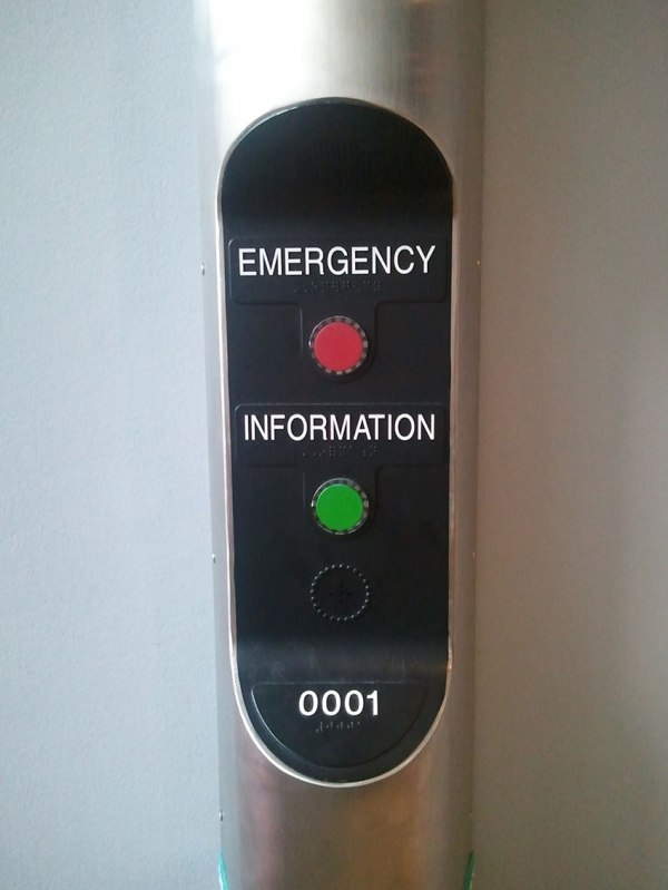
Think I took this photo inside MoMA in New York City, perhaps part of an exhibit on modern technology. To me, it captures perfectly everything that’s right and wrong about being clear in “Dashboards” that we present for business intelligence, operations or troubleshooting. This is exactly what real people ask us to do – just show them what’s important. Nothing more, nothing less. Bold and decisive. Straightforward. Utilitarian. Beautiful.
In some ways, this would have been the perfect dashboard to monitor and take action on many of the projects I’ve worked on.
Too simple?
Too limited?
Too crude?
Think again…
