
 “Electronic information is useless unless it can be acted upon in some meaningful way. That requires a contract or understanding that the content is not “dead” on the screen, but actually alive and inviting interaction.”
– M. Pell
I’ve spent many years looking at how we can enable exploration and action as an integral part of presenting information. Here are a few of the projects the illustrate that investigation.
![]()
Modern Datacenter Management
Microsoft Corp.
(current)
The important thing to realize about collections of information or “dashboards” is that they need to be glanceable and understandable at the same time. People often are interrupted and cannot give the displays we provide them their full attention (and perhaps they shouldn’t ever need to). This leaves us wanting to provide starting points that clarify the data but at the same time invite further exploration and action.

Exploring Big Data
Microsoft Corp.
2012
As part of our explorations of the issues that confront IT Pros, we did some design work around using time as a major axis for data explorations of Big Data. The key findings of this work were that people need both gross targeting or scrubbing of date ranges as well as fine grain control. There are situations where precise dates are not known, but scrubbing through time reveals the trends that are most interesting.

“StockVision” Datablade
Wild Tangent, Inc.
2001
While designing a sales demo for a financial company website, the notion of using a “datablade” to explore not only the data but the context around financial events came up. This sketch is what I used to model the interactive 3D demo.
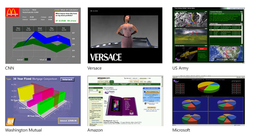
3D Interactive Pieces
Wild Tangent, Inc.
2000
I had the best job at the turn of the millennium – take a prospective customer (like Versace, Amazon, Nike, etc) and craft a fully interactive web-based piece that would help their customers more deeply interact with their products and services. Time-boxed explorations using the Wild Tangent 3D online game engine and HTML/JavaScript took just one week start to finish. Incredibly fun to work on, and in some cases still not matched on websites to this day.
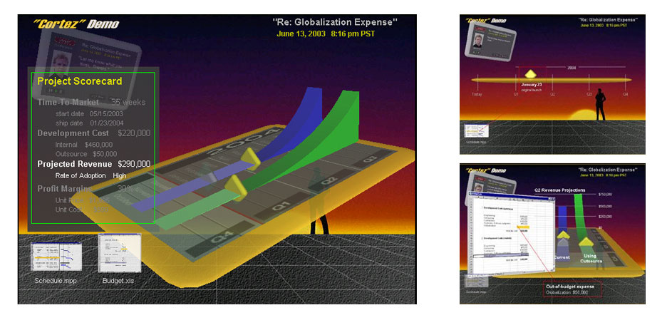
“Cortez”
next generation business presentation softwareFuturistic Design, Inc.
1999
Although it looks a bit dated today, this design work is still far ahead of its time even though it was conceived and coded up 14 years ago. The basic premise is that any business presentation is really a conversation that requires the ability to interact with the content to ask what if questions or change the data as needed on the fly to facilitate clearer communication. From a commercial standpoint, it still has not been achieved.
The hallmark of the design was to integrate disparate types of information and real-time communication capabilities in one workspace to allow for highly interactive discussions.
I do cringe a bit when I see the quality of the visuals these days, but this was the dawn of 3D UI and the online game engines were crude in comparison to what’s available today. Guess its the same feeling you get when you see a picture of yourself from the ’80’s.
